E-commerce Website Redesign: Alcohaul
Objective
More people have been drinking and hosting gatherings in the comforts of their own home amidst the raging pandemic last year. As demand spiked, alcohol distributors have rapidly flocked online offering alcohol delivery at a competitive speed and price.
Tasked with redesigning an e-commerce website as part of a UX immersive course, I thought it would be ‘worth a shot’ to understand what were the goals and frustrations of people who ordered alcohol online and how to improve their full purchase experience.
The brand
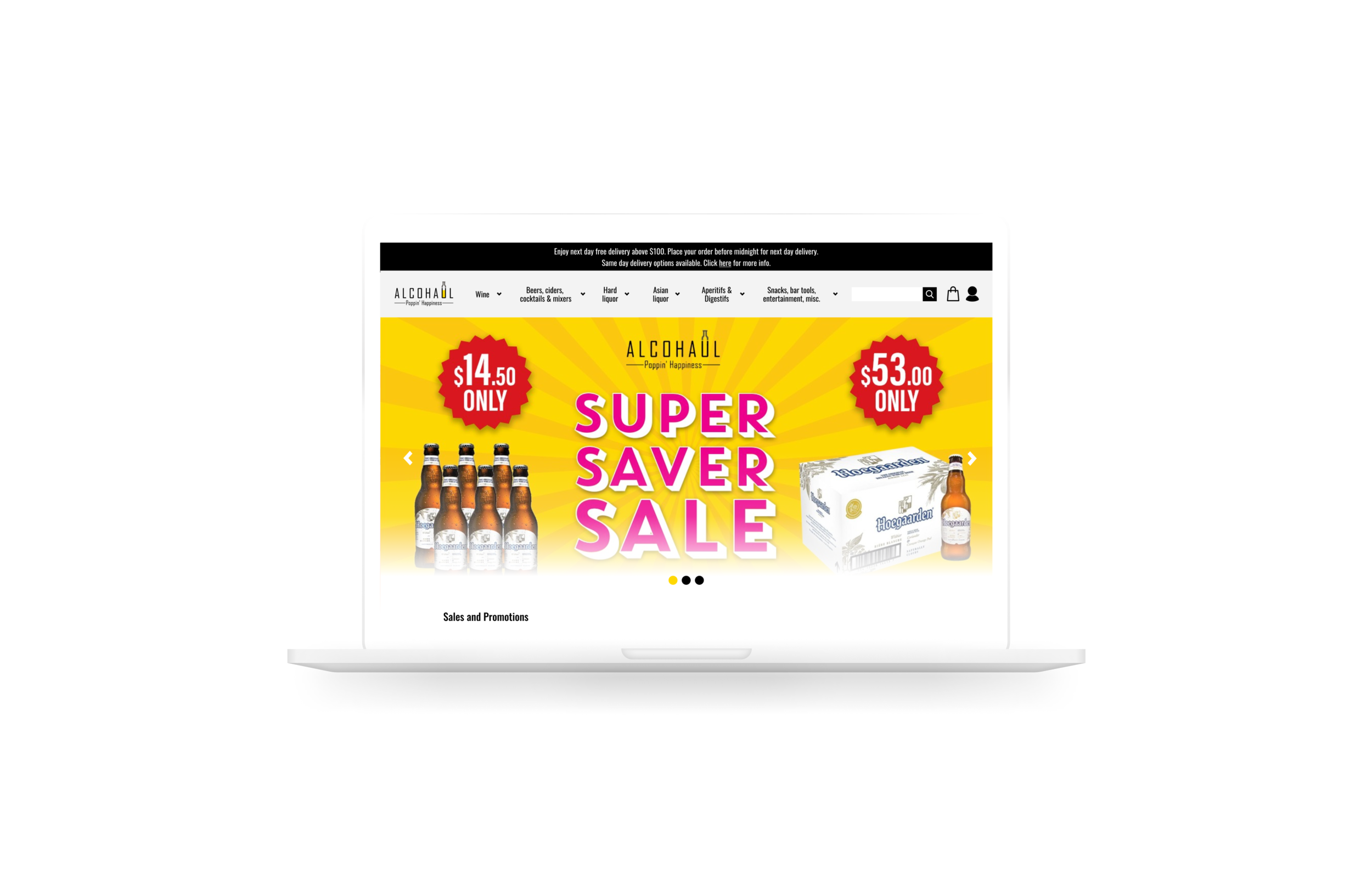
Alcohaul is a collective that aims to deliver alcohol at the best price, speed and reliability. Their goal is to allow consumers to get their favourite brands and discover new ones from the comfort of their home and have them delivered directly to their doorstep.
While this segment has been gaining traction, the stiffening competition means that Alcohaul needs to find ways to secure its market standing through a better user experience in the full purchase journey with the goal of improving conversion rates.
TIMELINE
2-weeks sprint
Aug 2021
MY ROLE
Solo UX Researcher & Designer
DELIVERABLES
User Research & Persona
Sitemap
User Flows
Interactive Prototypes
Usability Testing Report
TOOLS
Figma
OptimalSort
Google Tools
Design Process
User Interviews & Persona
I kicked off the project by conducting a series of user interviews with individuals age 20-35 who have purchased alcohol online or offline to understand why people consume alcohol and their key considerations when selecting and purchasing alcohol.
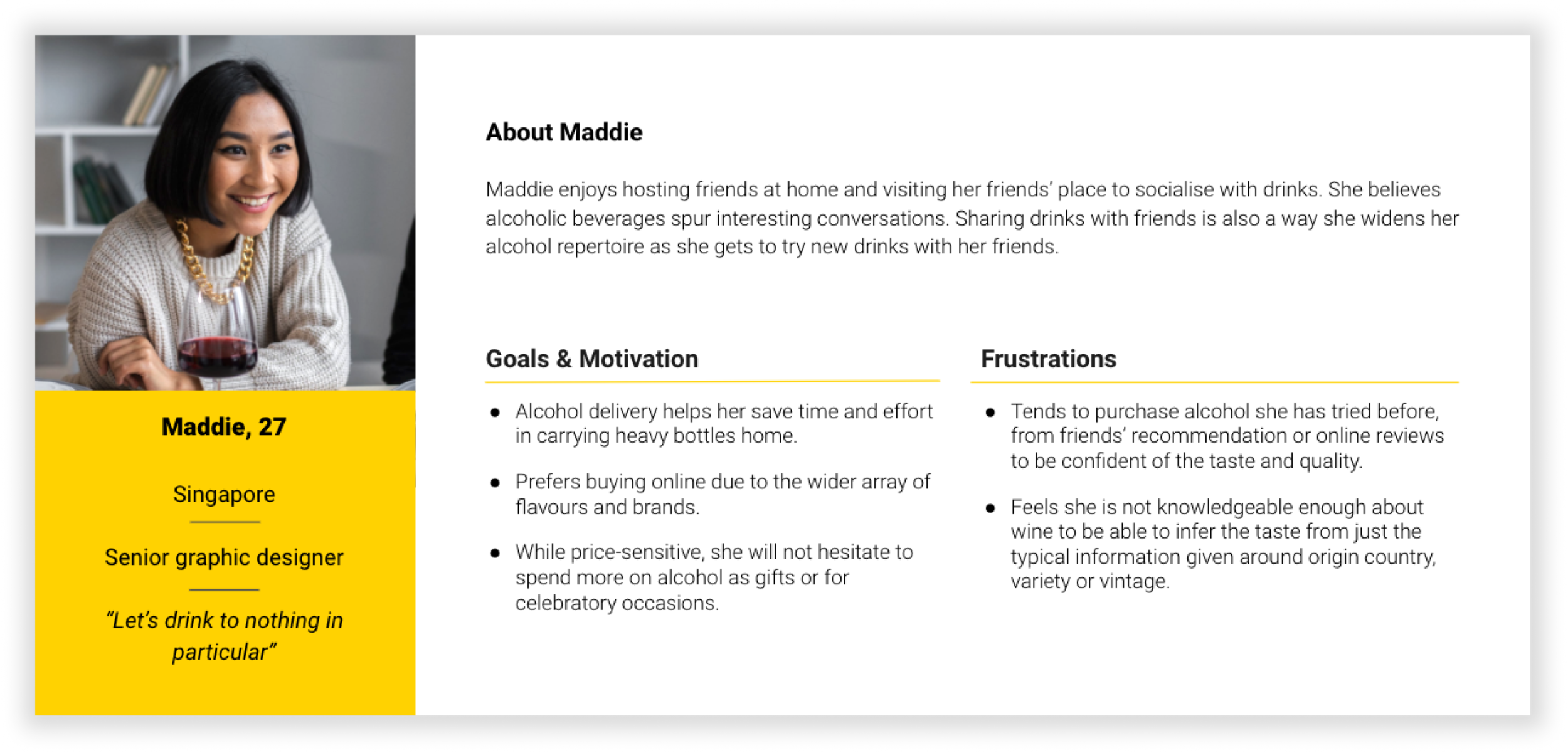
The insights from user interviews were distilled into my persona - Maddie, who is representative of the target user. She enjoys buying alcohol online due to the convenience and wide variety but is not confident in selecting a good product. Having a persona will allow me to keep in mind her unique background, goals and frustrations throughout the design process.
01
People are worried about buying alcohol that may not taste good. Exacerbated in e-comm where there is no way to sample the drink before purchase.
02
People do not feel knowledgeable enough about wine to be able to infer the taste from typical info given on the wine label.
03
Price is a key consideration when purchasing alcohol. People will look out for promotions and compare prices across platforms before purchasing alcohol.
Usability Test
Taking into account Maddie’s needs and frustrations, I set out 3 scenarios and tasks for the usability test. I also wanted to ensure the full purchase process is covered from product selection, purchase and post-purchase.
The usability test was conducted remotely with individuals who have previously purchased alcohol between ages of 20 - 35.
Select a specific varietal of wine - Malbec
Check-out cart
Resolve late/ missing delivery
How Might We …
Based on the research insights, I crafted 4 key HMW statements to reframe the identified key problems into open-ended questions that will act as the north star for me to ideate and design for the right problems.
01
How might we improve the homepage so that users find the webpage more credible and relevant?
03
How might we facilitate a seamless checkout?
02
How might we allow users to select their desired product easily with greater confidence on taste?
04
How might we make it quick and easy for users to get post-purchase support?
#1 Addressing Homepage and Navigation Design
HOW MIGHT WE IMPROVE THE HOMEPAGE SO THAT USERS FIND THE WEBPAGE MORE CREDIBLE AND RELEVANT?
It takes about 50 milliseconds for users to form a first impression that determines whether they will stay or drop off from the website¹.
¹ Lindgaard, G., Fernandes, G., Dudek, C., & Brown, J. (2006). Attention web designers: You have 50 milliseconds to make a good first impression! Behaviour & Information Technology, 25(2), 115–126. https://doi.org/10.1080/01449290500330448
To tackle 2 main issues around the “messy” and “not credible” homepage, and confusion surrounding the grouping of delivery and service info, I utilised a virtual open card sort with individuals who have previously purchased alcohol online or offline. While tree-testing would also help to determine the hierarchical category structure, due to time constraints I decided to depriortise this as it was not part of the key purchase flow.
STREAMLINING PRODUCT CATEGORIES
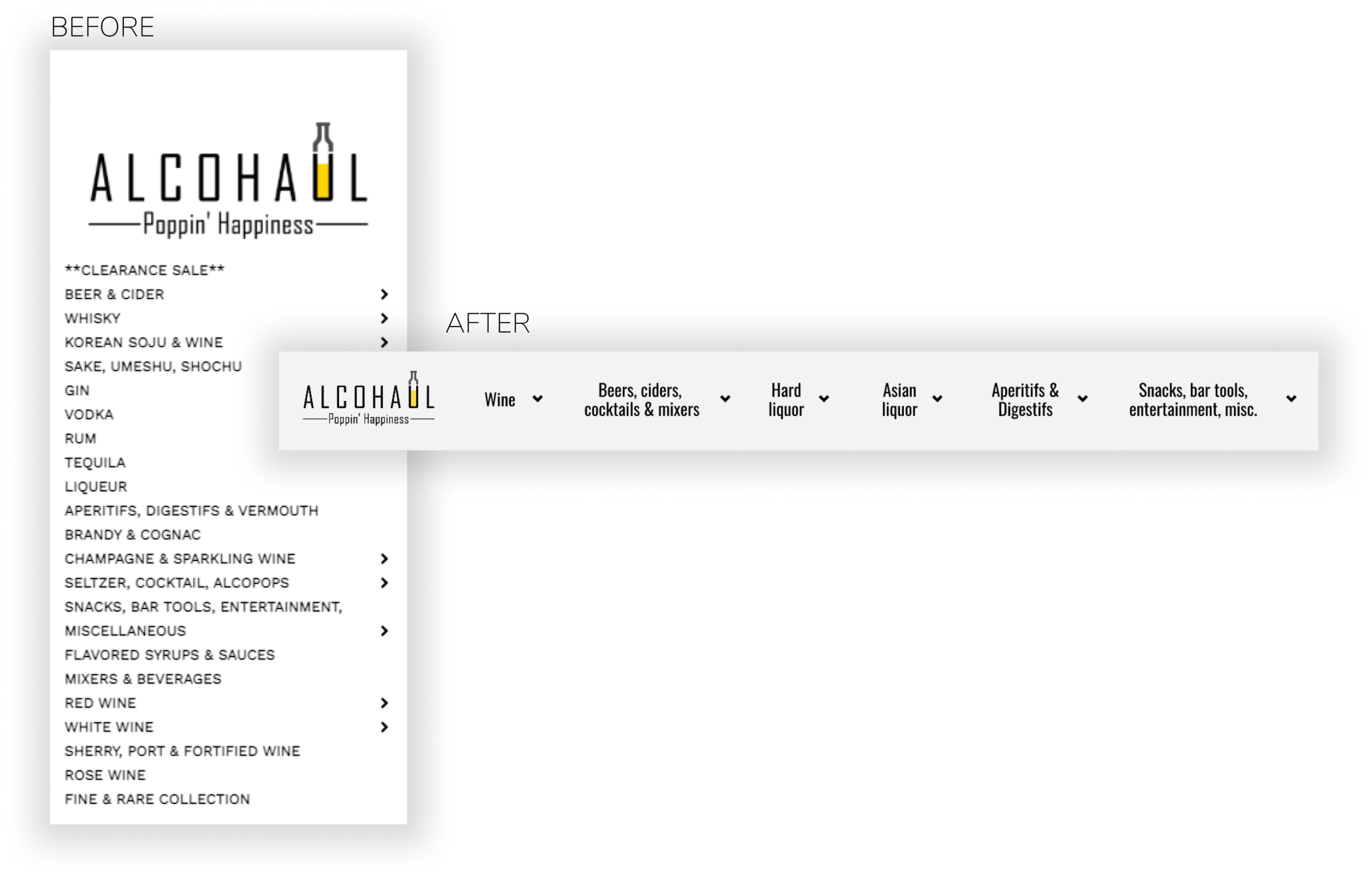
I identified 5 major groups of alcohol categories, which allowed me to streamline the overwhelming 20 categories shown on the mainpage down to a scannable 5, reducing homepage clutter.
STREAMLINING NAVIGATION
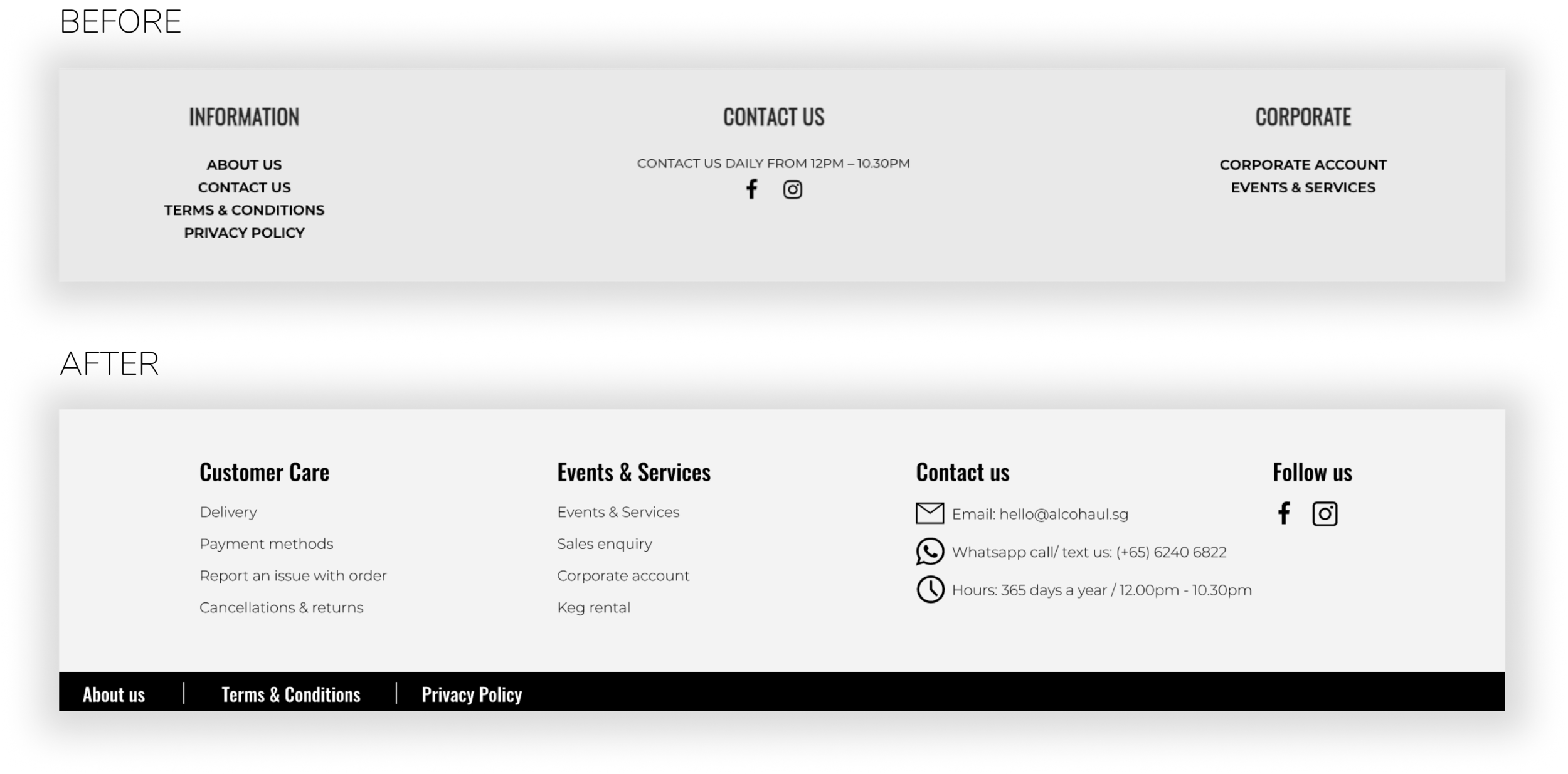
I also re-organised the information architecture of delivery and service information into meaningful buckets based on card sort and usability test feedback to improve ease of finding relevant information.
#2 Improving Product Selection Process
HOW MIGHT WE ALLOW USERS TO SELECT THEIR DESIRED PRODUCT EASILY WITH GREATER CONFIDENCE ON TASTE?
Selecting a product is a unique point in the purchase process that has the potential to spark delight as users enter the exploration stage - whether it is the anticipation of buying their staple favourites or exploring new products. Users are also more discriminatory at this point as they are conducting guesswork on the taste of the product.
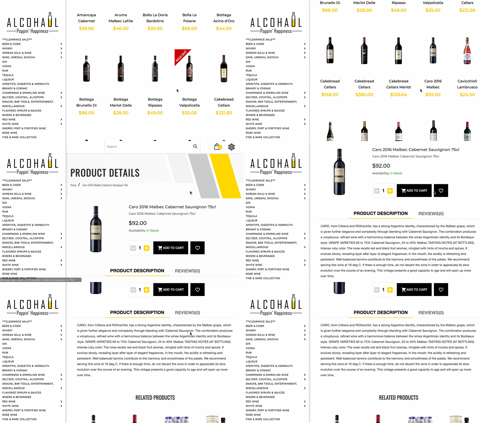
BEFORE
1. Hard to identify desired product due to lack of or inconsistent information presented per product.
2. No easy way to compare products - had to open multiple browser tabs and unable to filter desired products.
3. Frustrated at reading long text descriptions to find out taste.
AFTER
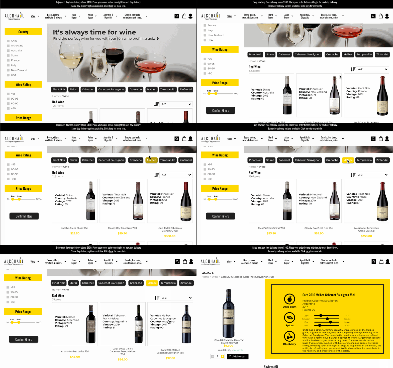
1. I added filter options so that users can shortlist quickly with freedom of control.
2. To quickly identify, compare and shortlist their product of choice, I implemented a standard info card for common wine attributes.
3. To reduce cognitive overload, I summarised long descriptions into key scannable flavour profiles.
#3 Addressing Cart Abandonment
HOW MIGHT WE FACILITATE A SEAMLESS CHECKOUT?
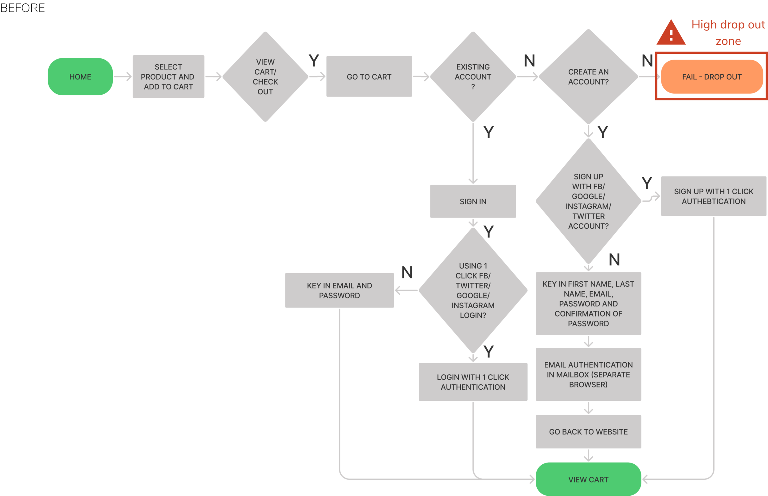
Usability testing revealed that users do not appreciate creating specific accounts just for a specific e-comm purchase. Forcing users to sign-up/ log-in just to view their cart or check-out is a recipe for disastrous cart drop-out.
To prevent users from falling out of the purchase funnel at this crucial point, I removed the login requirement to view cart and for checking out. To ensure that we maintain marketing and EDM support, a newsletter opt-in checkbox is provided at checkout.
#4 Addressing Lack of Post-purchase Support
HOW MIGHT WE MAKE IT QUICK AND EASY FOR USERS TO GET POST-PURCHASE SUPPORT?
The highlight of my usability study was witnessing the outburst of emotions that users felt even in a simulated scenario. When asked to look for a resolution for their late delivery, users were simply unable to find a contact number to speak to a service representative as it was hidden under the “about us” page. The pouring outrage signalled that the current support system deviated from users’ mental model.
Users spend most of their time on other sites. This means that users prefer your site to work the same way as all the other sites they already know².
² Jakob's Law of Internet User Experience
To worsen the situation, all of the users expressed a strong distaste on the feedback form due to the lead time required to hear back as well as the lack of a “human touch” to an already upsetting situation.
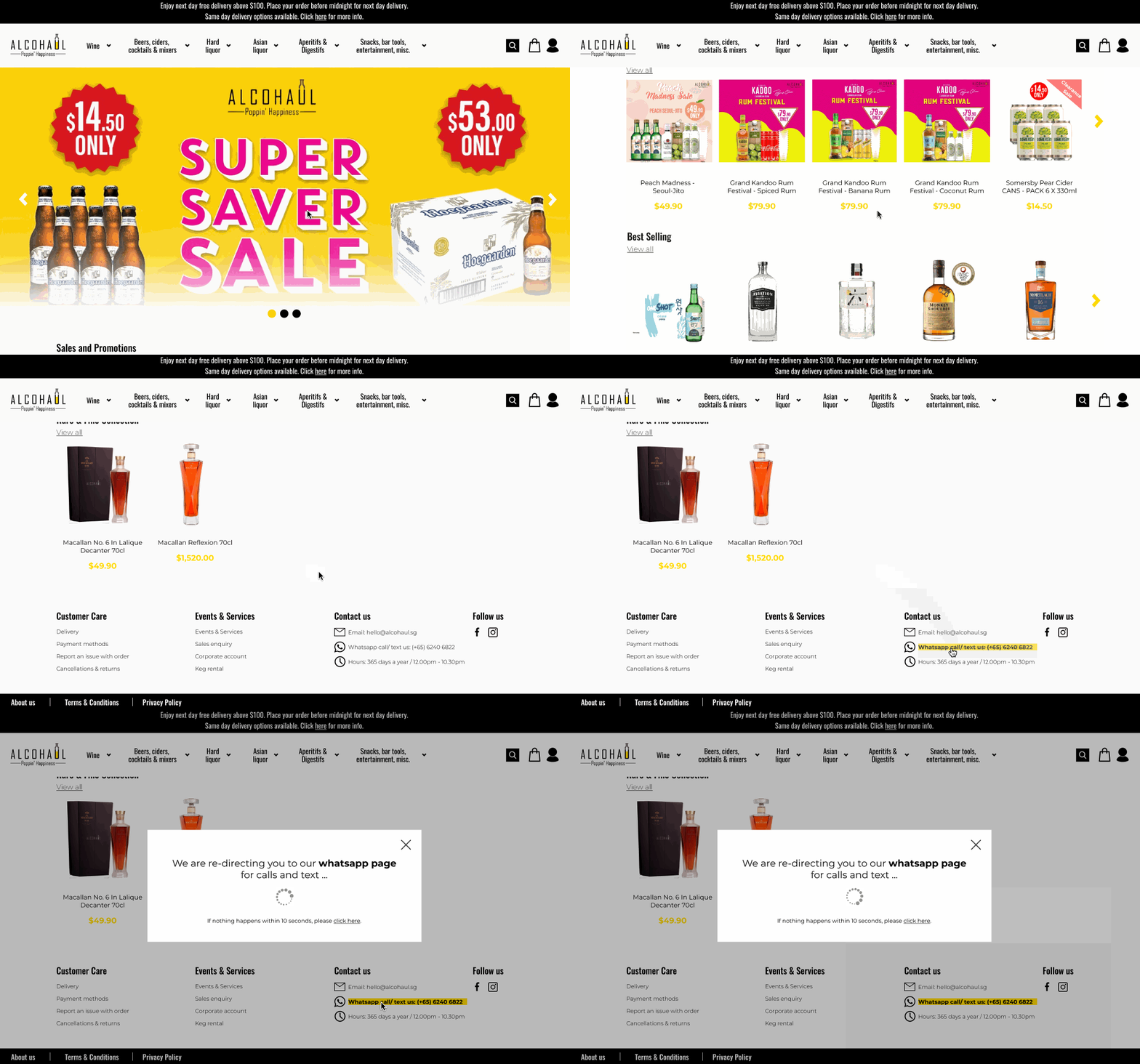
The solution is simple - I included a contact number on the universal footer for intuitive access where users expect it.
To further reduce the time and effort required to reach out to a customer service representation, I added a quick interaction for users to be immediately directed to Alcohaul’s Whatsapp page upon clicking on the number.
Iteration & Validation
With the updated prototype, I then conducted another round of usability test with the same target group to understand whether the first round of redesign is able to solve the key frustrations users identified.
EASE OF USAGE PERFORMANCE
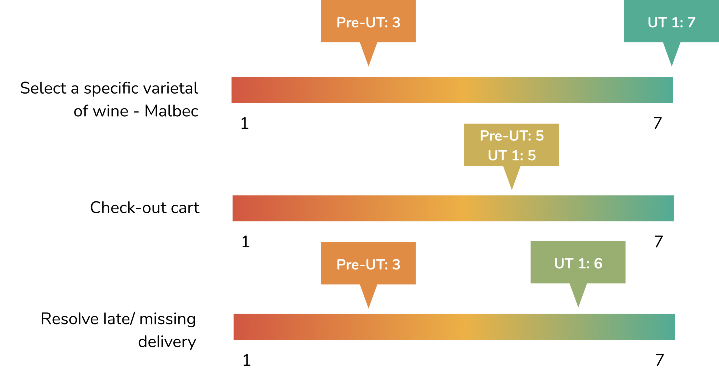
The Single Ease Question (SEQ) is a 7-point rating scale to assess how easy users find a task.
Ease of usage improved significantly for the 2 task flows that initially had the worst experience - product selection and post-purchase issue resolution.
That being said, there were still areas of improvement for the checkout delivery selection process.
KEY HIGHLIGHTS
Quickly shortlisted wine to buy at browsing page without clicking into individual product page
Enjoy the scannable product taste profile - “screenshot-able 1-pager to share with friends.”
Seamless checkout process
Found contact number within <5 seconds from start of task. Like that they did not have to jot down number to call
Next Steps
FURTHER ITERATION & VALIDATION
Based on users’ feedback around areas of opportunity, I further updated the prototype for future validation and iterations which can be found above.
Conduct another round of usability testing on the iterated prototype to ensure raised issues are resolved.
PRODUCT SELECTION
Implement the same redesign around info standardisation, filters and 1-pager product detail which was done for the wine category for other alcohol types and test again, to validate whether the difference in alcohol attributes will impact results.
POST-PURCHASE SUPPORT AND CUSTOMER REVIEWS
Further explore how users can easily resolve purchase issues without looking for their order reference number e.g. linking their contact number in the system to display their order details once they enter the Alcohaul Whatsapp business page.
As part of their purchase decision making process, users would like to see more reviews from buyers to boost their confidence on the product quality. Next steps should include how we can encourage user reviews post-purchase e.g. through incentives/ gratification, in order to improve trust and quality perceptions to drive purchase.
Challenges & Key Takeaway
SOLVE FOR THE USERS’ CORE NEED
When tackling the problem of lack of post-purchase support, I was initially fixated on users being unable to find the contact number which was the key issue observed from usability testing. However, upon referencing the ‘How Might We’ statement which encompasses a broader users’ goal, I was able to ideate even further for a more holistic solution.
LOW-TO-MID-FIDELITY PROTOTYPE TO VALIDATE IDEAS
Prototyping mid-to-high fidelity at an early stage gave rise to more comments on the colours and visual of the website, rather than the actual concept. The wireframing also took up more time than expected, tossing my plan to conduct a second round of usability testing. The next time I approach this, I would start at mid-fi and work up to high-fi after validation of concept to maximise the resource usage.

